| ||||||||||||||||||||||||||||||||||||||||||||||||||||||||||||||||||||||||||||||||||||||||||||||||||||||||||||||||||||||||||||||
|
The Emissia.Offline Letters Электронное научное издание (педагогические и психологические науки) | ||||||||||||||||||||||||||||||||||||||||||||||||||||||||||||||||||||||||||||||||||||||||||||||||||||||||||||||||||||||||||||||
|
Издается с 7 ноября 1995 г. Учредитель: Российский государственный педагогический университет им. А.И.Герцена, Санкт-Петербург | ||||||||||||||||||||||||||||||||||||||||||||||||||||||||||||||||||||||||||||||||||||||||||||||||||||||||||||||||||||||||||||||
|
||||||||||||||||||||||||||||||||||||||||||||||||||||||||||||||||||||||||||||||||||||||||||||||||||||||||||||||||||||||||||||||
|
Yulia A. Griber Ivar L. Jung Ralf Weber
Abstract Key words _________ Грибер Юлия Александровна Юнг Ивар Л. Вебер Ральф
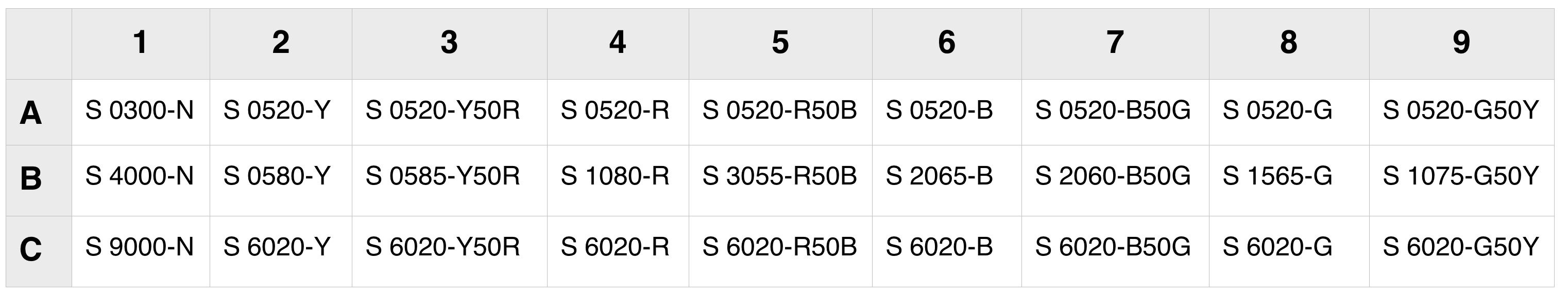
Аннотация Ключевые слова _________ Introduction While there is a long history of experimental researching the meanings of color in German culture (see e.g.: [10–11]), the most previous studies used a limited set of verbal stimuli, that included no more than eleven basic color terms found in Berlin and Kay’s study on color names in various languages [12]. In this paper we are seeking to overcome the outlined limitations of the previous investigations and report a study examining how an extended set of visual color stimuli with different hue, lightness and saturation, originally developed by Ivar Jung [13], were associated with specific concepts by subjects from Germany. Materials and method Procedure. Data were collected in an experiment that previously was performed by Ivar Jung in 2015–2016 during a pilot stage in Sweden (N=70) and Nepal (N=77) [13], and in 2017 was conducted in Uganda (N=70) and Russia (N=70) [14–15]. Experiment participants were presented 13 pairs of opposites: warm–cold, sorrow–happiness, calm–upset, near–distant, young–old, feminine–masculine, fast–slow, strong–weak, false–true, cheap–expensive, friendly–dangerous, healthy–sick, me–others. The stimulus concepts were selected from previous research on color associations (e.g.: [2; 4–6]). Participants were asked to match the best suited color associations for the given terms. Color stimuli. The color chart of the experiment consisted of 27 samples, selected from the Natural Color System (NCS). It included saturated shades of four primary colors (Y – yellow, R – red, B – blue, G – green) and four secondary colors (Y50R – yellow-red, R50B – purple, B50G – blue-green, G50Y – green-yellow) (middle row in Table 1). Additionally, we included into the chart one light (top row in Table 1) and one dark (bottom row in Table 1) shade of every primary and secondary color, as well as three achromatic colors – white, grey, and black. Stimulus size was 3 by 5 centimeters. All color samples were presented to participants at the same time under standard daylight illumination. Table 1 Color samples of the experiment
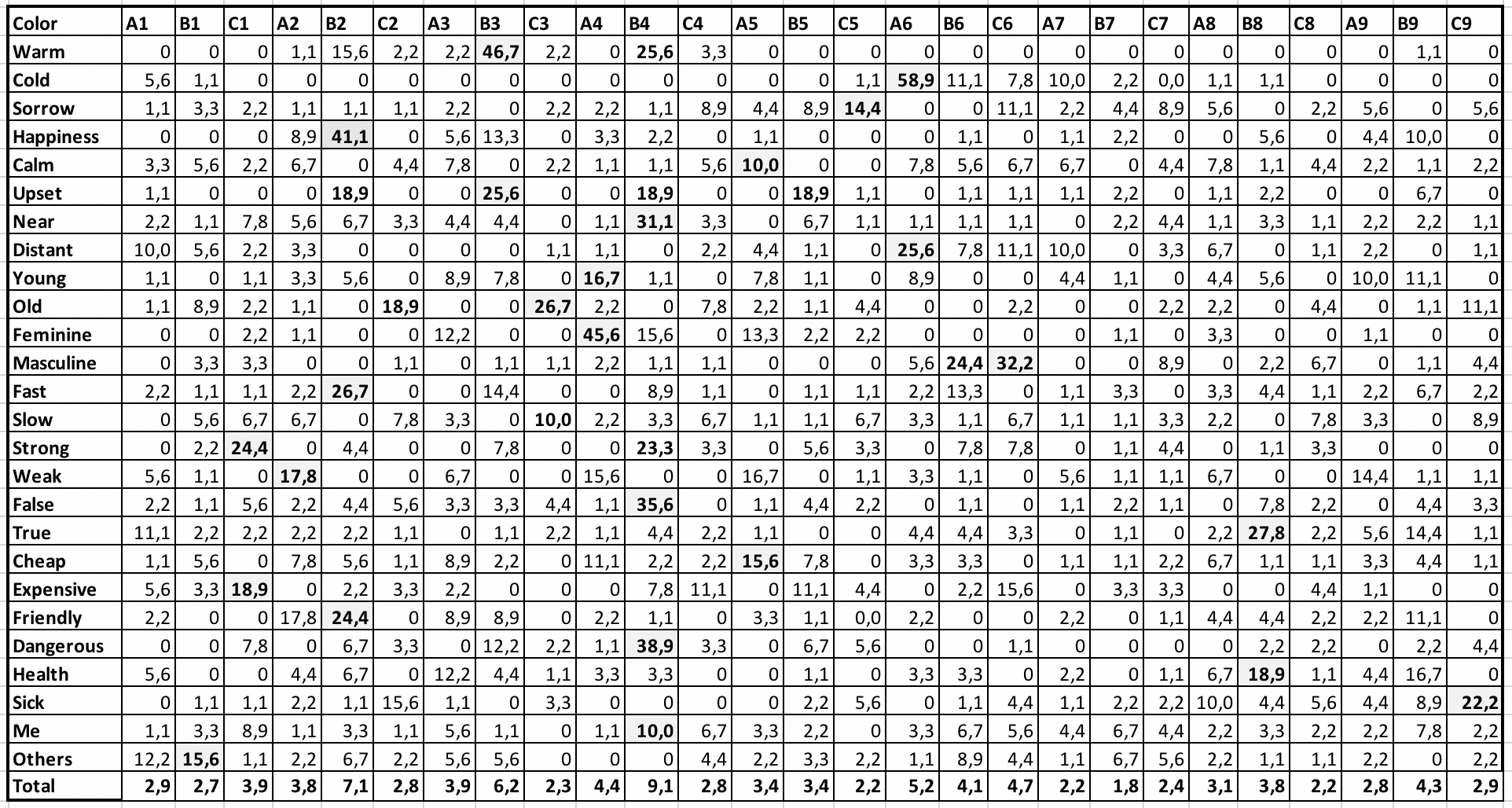
Results and discussion Table 2 Percentage associations to each concept
The 2,340 responses of the experiment participants filled in the cells, unevenly distributed. One third of all the matrix cells (237) remained empty: none of the participants connected the provided concepts with a particular color. Another one third of matches (213) referred to single instances, since they appeared only by one or maximum two participants and thus cannot be considered relevant. The majority of weak associations lay in the red-blue (RB), green (G), and blue-green (BG) regions of the color spectrum. Thus, only the remaining one third (252) from all the matrix cells were of interest for the color association analysis (Figure 1)
Figure 1. The results of associative connections of shades Chi-square tests performed for each of the twenty-six concepts showed that twenty-three of them were associated significantly with at least one color at the 0.0001 level of significance (df. 26). The concepts calm, slow, and me did not have particular associated colors (Table 3). Table 3 The most significant associations
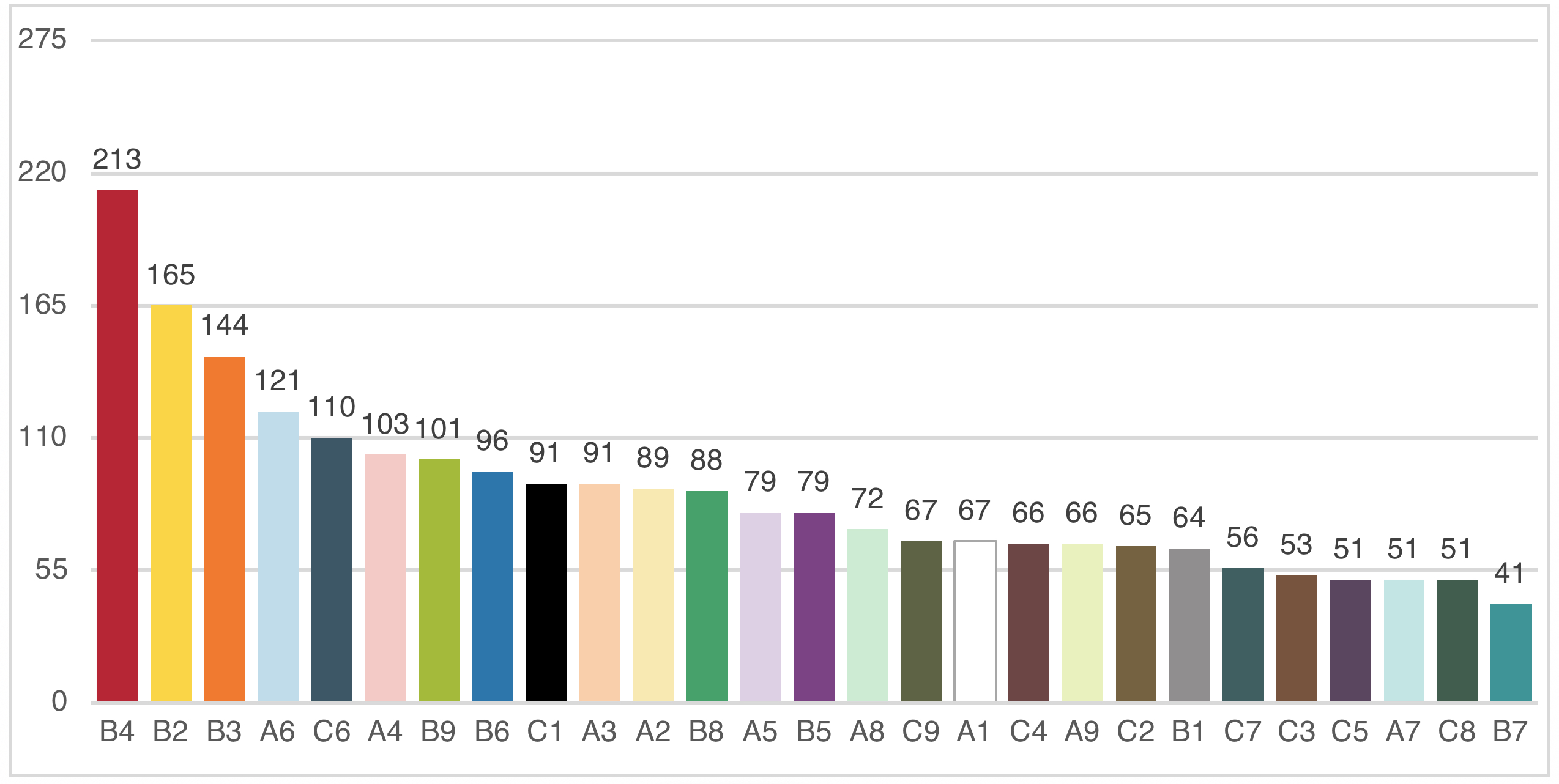
Across 90 observers, each color sample used in this study was chosen up to 6 times (on average 0.97 times, SD = 0.43). 10 of 27 shades were selected more frequently than others (>10% of choices). These are two shades of red (B4 and A4) and yellow-red (B3 and A3), three shades of blue (A6, B6, and C6), together with bright yellow (B2), bright yellow-green (B9) and black (C1) (Figure 2).
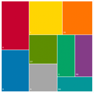
Figure 2. The total number of associations of 27 color samples The number of associated terms varied with color. Red (B4) and light-yellow (A2) elicited the highest number of concept associations (20), while dark-orange (C3) the lowest (12). Color associations had different intensities. The highest intensity of associations was revealed for light-blue (A6) with cold (59%), orange (B3) with warm (47%), pink (A4) with feminine (46%), yellow (B2) with happiness (41%). The lowest intensity of associated notions (<10%) had light, saturated and dark blue-green (A7, B7, C7), light and dark green (A8, C8). In accordance with previous findings [4; 6], the primary hues yielded the greatest number of associations. The most popular were shades of red (R) (16%), blue (B) and yellow (Y) (both 14%) colors (Figure 3, left), summing to a total of almost half (44%) of the concepts tested. The distribution of associations between the groups of shades with different lightness showed that saturated colors (group B) occurred most frequently (Figure 3, right).
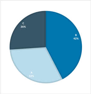
Figure 3. Associations with hue (left) and groups of shades (right) Additionally, we analyzed the correlation between the terms and three achromatic colors – white, grey and black (Figure 4). Achromatic colors were chosen in one tenth of all responses (9,5%). We revealed significant achromatic color associations only for two concepts – strong and expensive were linked with black (24,4% and 18,9% respectively).
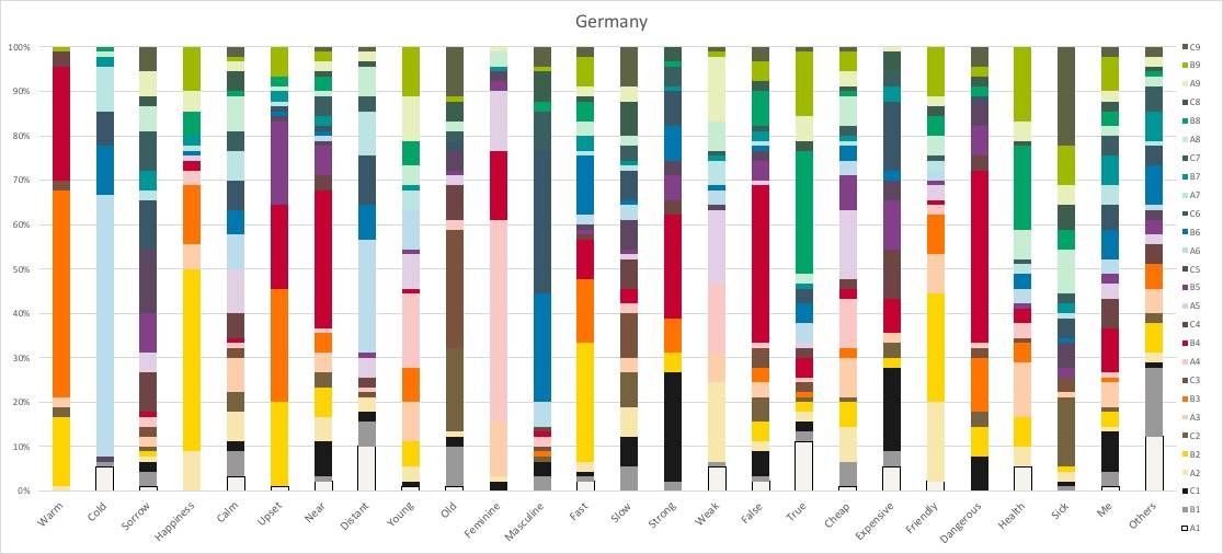
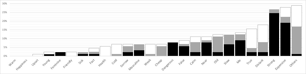
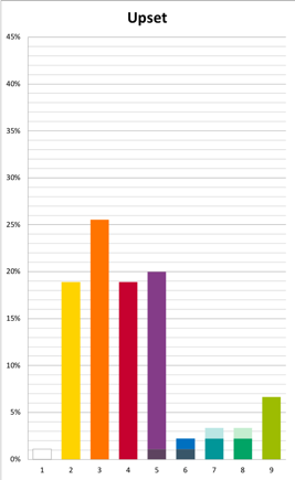
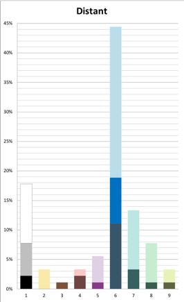
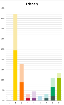
Figure 4. Associations with achromatic shades To reveal the culture specific associations the outcome for the German sample was compared to Swedish (N=70) [13; 14] and Russian (N=70) samples [14; 15]. The results showed unique color associations (with value divergence more than 15%) among the Germans especially for the concepts sorrow, upset, distant, and friendly (Figure 5).
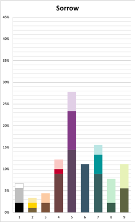
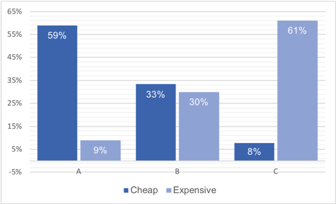
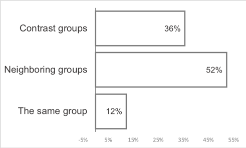
Figure 5. Color associations for the concepts In addition, for the pair of opposite concepts cheap–expensive a statistically significant difference was revealed in German sub-sample between the groups of shades (Figure 6). The great majority of participants (88%) chose color shades from different groups to denote the opposite concepts. More than a half of them (52%) matched the terms with the shades from neighboring groups: brilliant (B) – with one concept, and light or dark (A or C) – with the other one. More than a third of the participants (36%) connected the terms with extremely contrasting shades: light (A) and dark (C).
Figure 6. Associations with the groups of shades Conclusions First, our findings affirm that there are consistent patterns in color choices for concepts within the German sample, showing that participants were making non-random color-concept matches. Second, the use of an extended set of visual color stimuli allowed us to conduct a quantitative analysis of the chromatic structure of the concepts. We were able to specify hue, lightness and saturation of shades forming color associations and to visualize chromatic images related to these concepts in German sample. This experiment is part of a series of experiments with color associations, which were performed in a number of countries hitherto. In further tests, a specified neutral background (NCS S 0500-N) will be chosen. The results could be valuable in finding out whether there are commonalities in the association of color with certain adjectives describing moods. The results might be further of interest in compiling topical dictionaries and reference books, teaching activities, as well as contributing to a great spectrum of practical tasks in architecture, design and advertising communication. Acknowledgements
Рекомендовано к публикации: Литература
| ||||||||||||||||||||||||||||||||||||||||||||||||||||||||||||||||||||||||||||||||||||||||||||||||||||||||||||||||||||||||||||||
|
| ||||||||||||||||||||||||||||||||||||||||||||||||||||||||||||||||||||||||||||||||||||||||||||||||||||||||||||||||||||||||||||||
| Copyright (C) 2018, Письма в Эмиссия.Оффлайн (The
Emissia.Offline Letters): электронный научный журнал ISSN 1997-8588 (online). ISSN 2412-5520 (print-smart), ISSN 2500-2244 (CD-R) Свидетельство о регистрации СМИ Эл № ФС77-33379 (000863) от 02.10.2008 от Федеральной службы по надзору в сфере связи и массовых коммуникаций При перепечатке и цитировании просим ссылаться на " Письма в Эмиссия.Оффлайн ". Эл.почта: emissia@mail.ru Internet: http://www.emissia.org/ Тел.: +7-812-9817711, +7-904-3301873 Адрес редакции: 191186, Санкт-Петербург, наб. р. Мойки, 48, РГПУ им. А.И.Герцена, корп.11, к.24а Издатель: Консультационное бюро доктора Ахаяна [ИП Ахаян А.А.], гос. рег. 306784721900012 от 07,08,2006.
|